Ipagoo
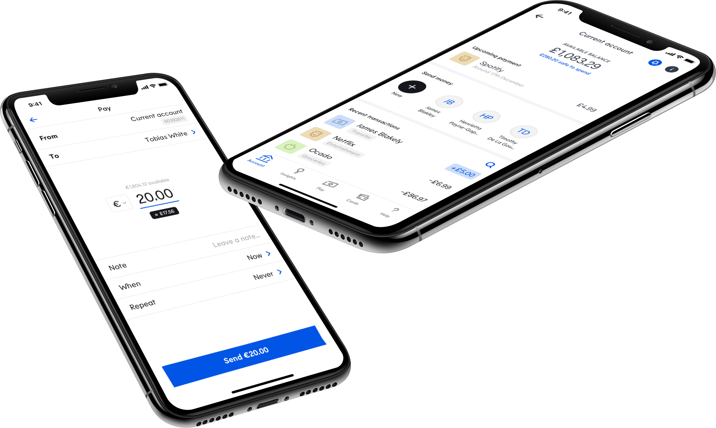
Legacy application
Ipagoo is a consumer banking application that served multiple countries, each with their own financial regulations. This required a modular system that could cater to each country’s differing requirements.
Ipagoo faced UX and UI challenges in their legacy application with how they attempted to solve this. Prior to my involvement, it had been addressed by a sequence of screens, each requesting a single piece of information from a user, resulting in a total of more than 50 different screens before a user could get a taste of the application. Although this solution allowed the position and content of each screen to be called in an bespoke for each country, it resulted in a lengthy registration process and large development overhead for mobile developers and the API team.
Ipagoo’s visual style also lacked in voice and personality.
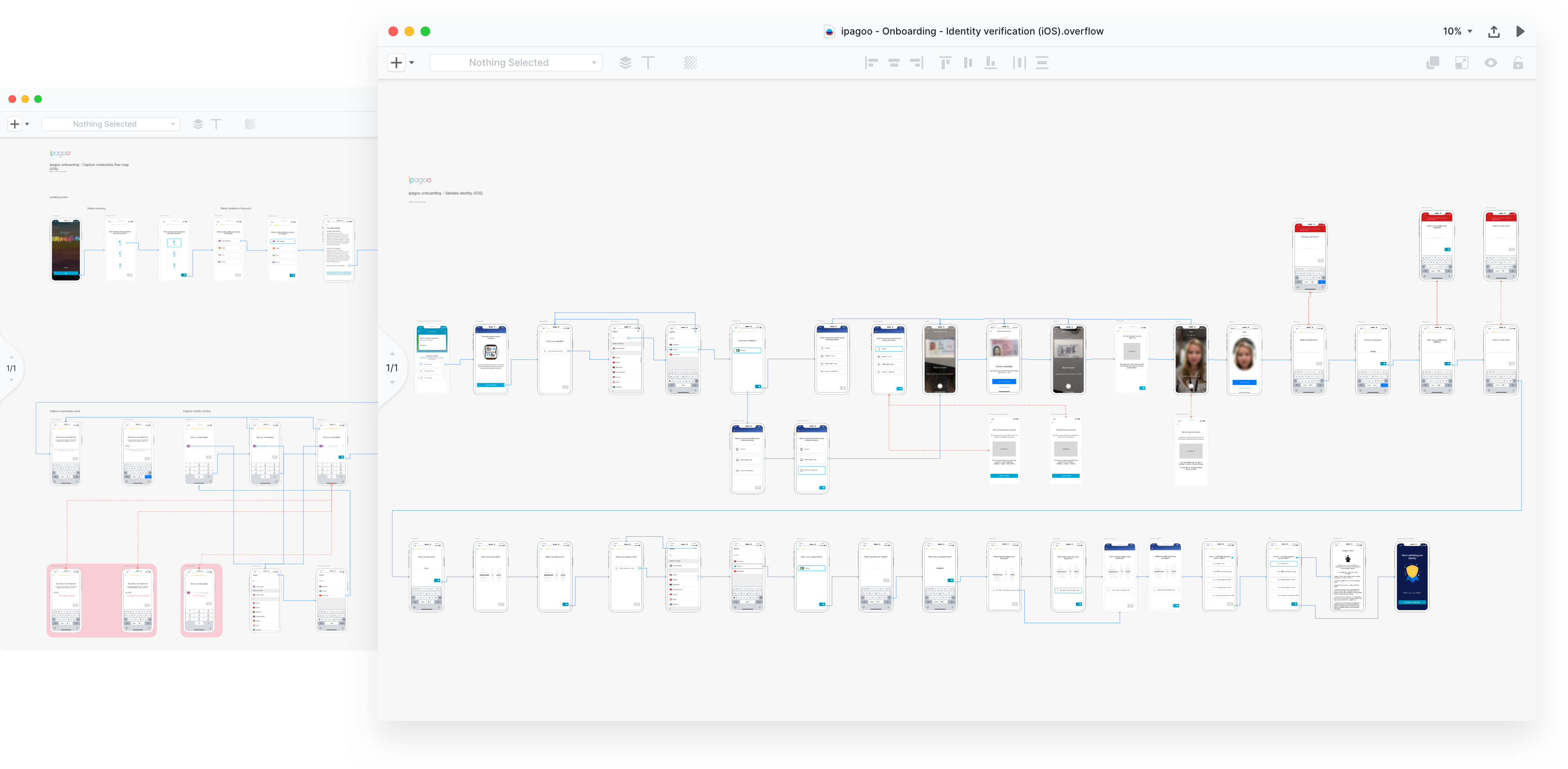
Ipagoo’s original flow diagram
Little by little
The registration flow was redesigned in a way where customers would feel as if they’re within touching distance of the final hurdle by utilising progressive disclosure. Users could reach the application chrome within 3 screens, down from 50.
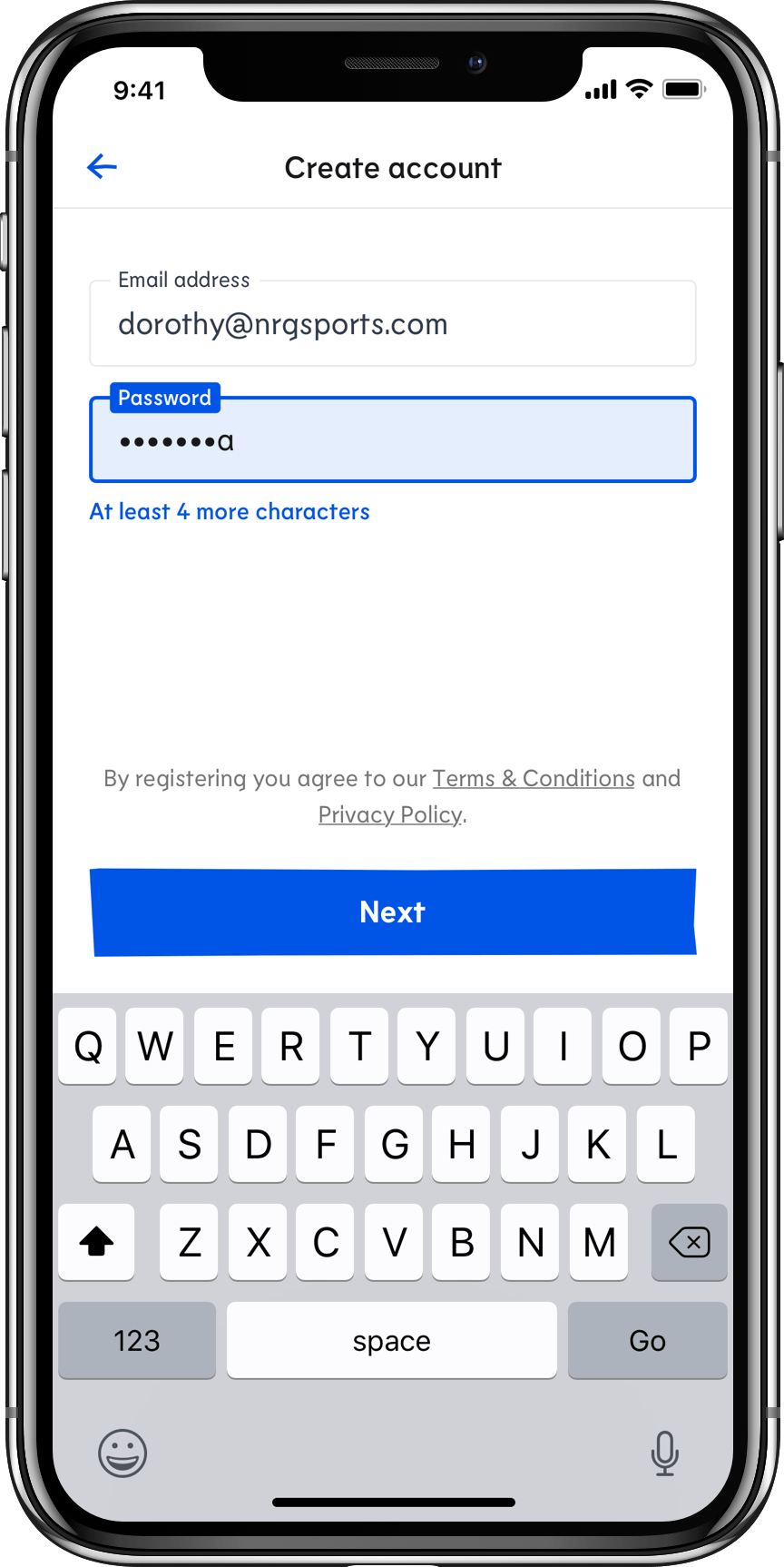
Step 1: Create an account
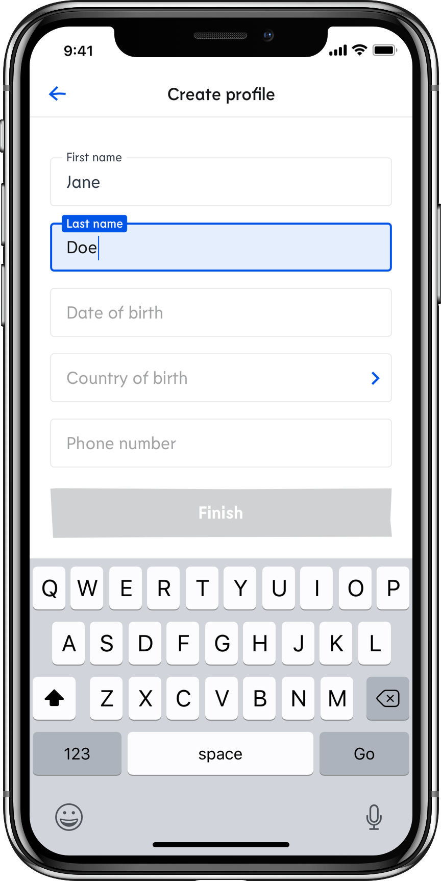
Step 2: Create a profile
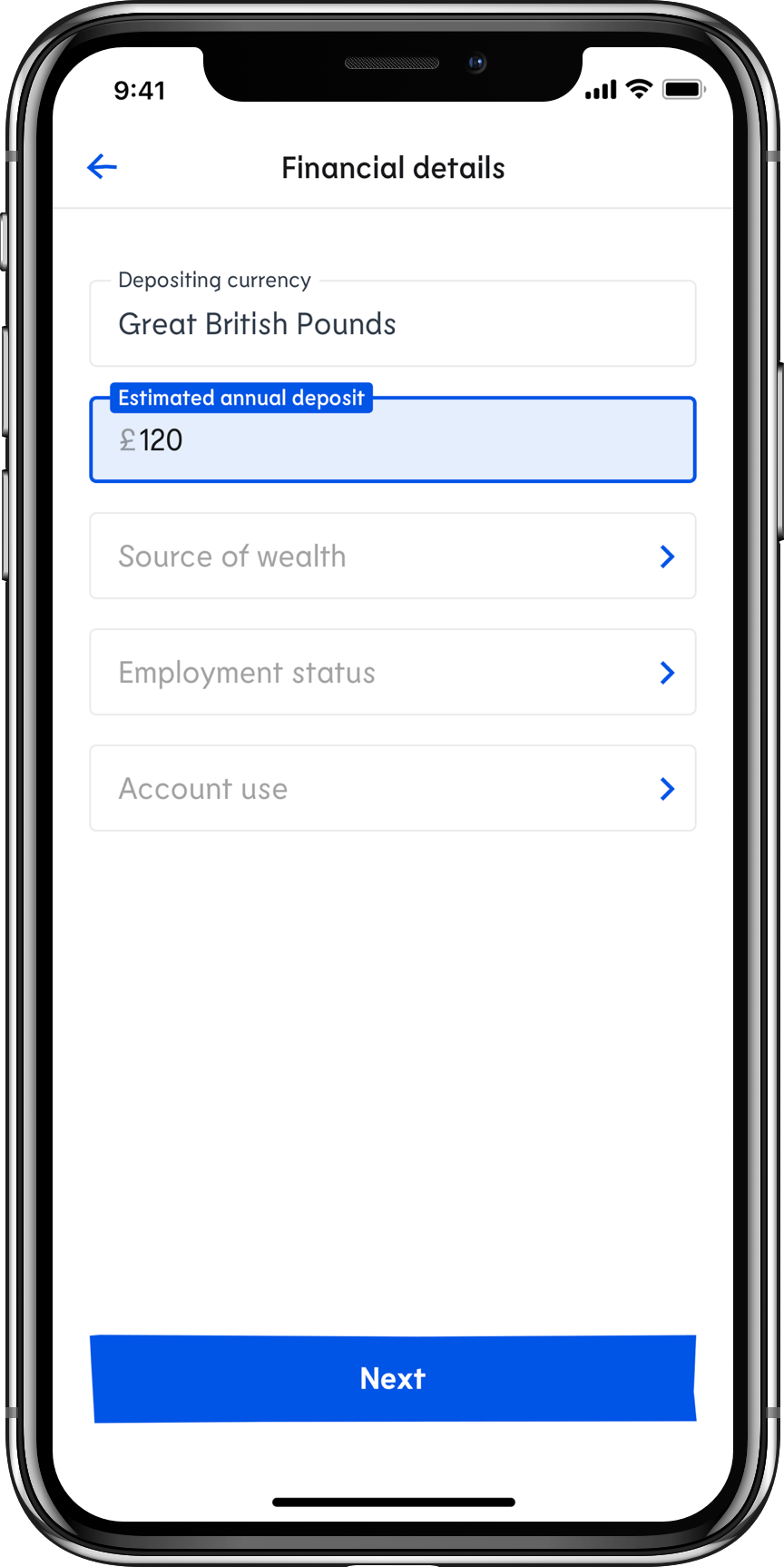
Step 3: Enter country-specific information
The first of three screens asked for information one provides to most applications requiring an account: an email address and password.
The second prompted users to create a profile, detailing specifics such as first name, last name, and date of birth, all of which are frictionless for a user to enter.
The third and final screen requested country-specific details pertaining to regulation. After this step, they are shown an illustrative holding screen informing users that manual verification is required which may take up to 24 hours. During this time they were free to explore all functionality of the application. We hoped illustrations and animations would instill some delight in what may otherwise be a frustrating moment.
A secondary benefit to collecting information in this order would promise greater reactivation potential from customers who do not fully complete registration.
Custom iconography
I crafted a hand-drawn icon set for use throughout the application. To further distinguish Ipagoo from the majority of banking applications that depend on geometric grid system iconography, the icon set didn’t utilise any forms of grid or system other than uniform colour and stroke width. It allowed a human, unconstrained icon set that was unique and glyphic.


Delight in illustrations
The same technique was applied to illustrations and lent a greater strength of brand and voice while engineering emotions at each stage. These are flourishes that financial incumbents hesitate to implement as they attempt to appeal the lowest common denominator of user.
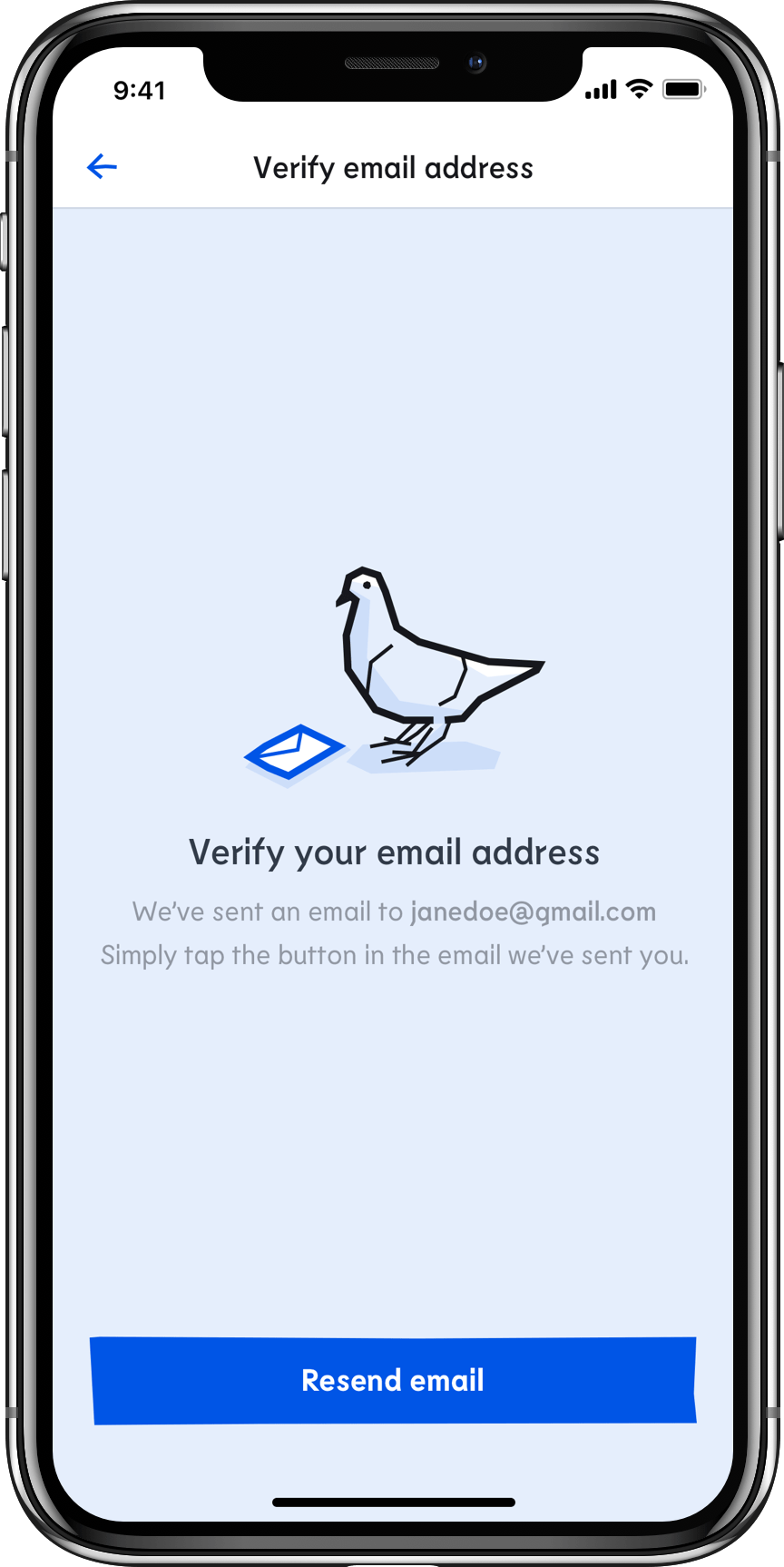
Added character to email verifications
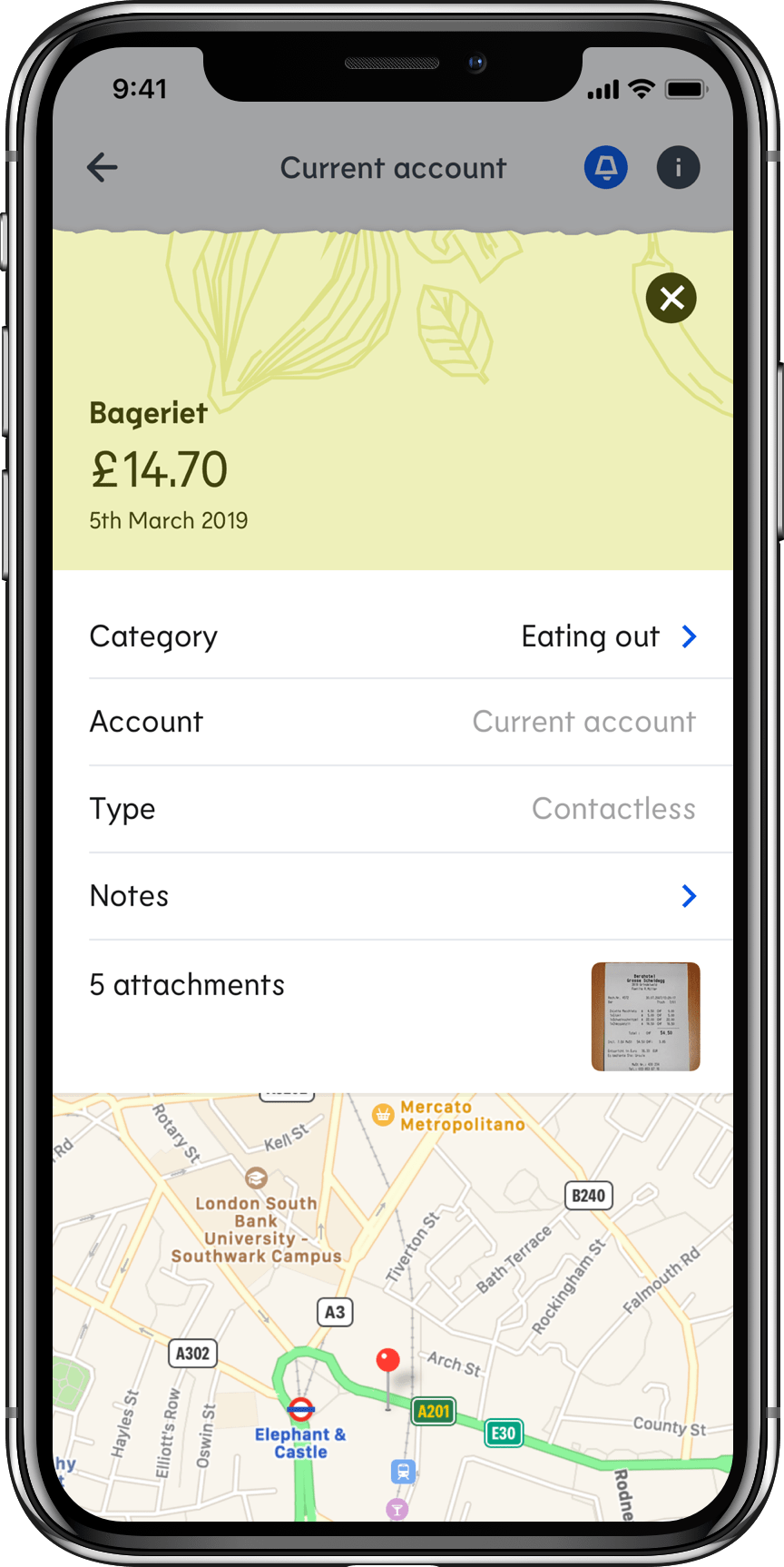
Subtle patterns to enhance understanding
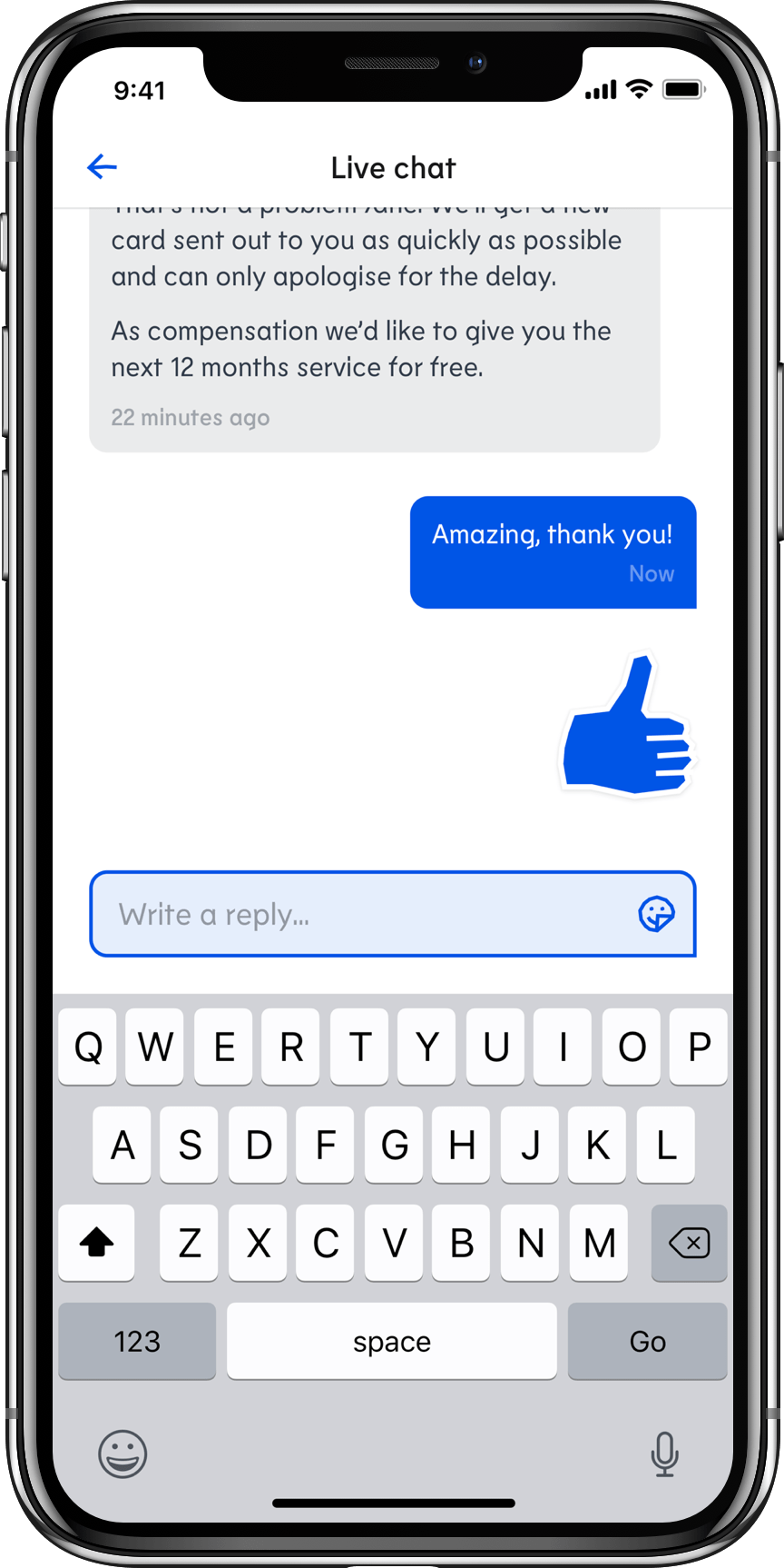
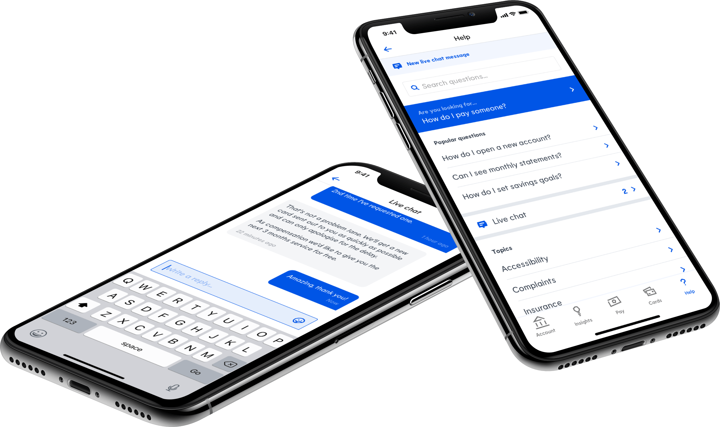
Personality when communicating with support
Typography
To further separate Ipagoo’s identity from competitors, we selected the confident and unique typeface Lemur that conveys personality and individuality yet maintains the trust required of a financial institution.
Lemur complemented the glyphic approach to iconography and illustrations while bringing a lot of personality to the application.

Outcomes
Before the new version of the application could be developed or released, the company regrettably went into administration.