Moneybox
I joined Moneybox in 2015 as their first full-time employee. Upon my first coffee with the founders, they held a napkin sketch and the desire to empower a new generation of investors. When I left the company, we had taken Moneybox from pre-launch to over 300,000 investors with a 5-star rated application on both Android and iOS. It has since been featured numerous times on the App Store’s ‘Today’ screen.
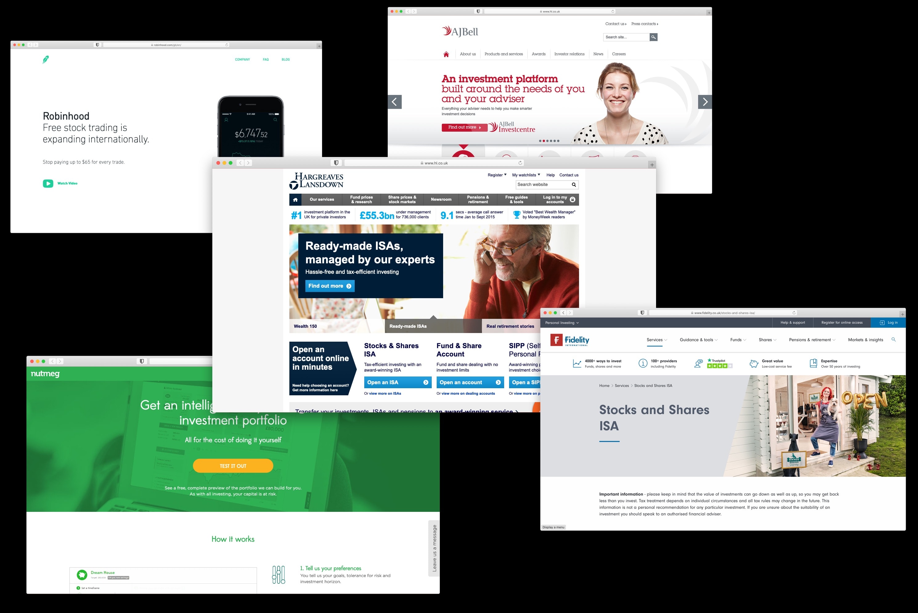
Market analysis
We began by analysing a variety of consumer investment products from Britain and abroad, documenting their registration flows, features, communication style, and brand. Subsequently, I created an audit detailing where Moneybox could best its competitors and used this to inform design decisions in the early stages.
Getting users invested
I had many ideas for how a registration flow could be implemented ranging from story-driven interfaces to conversational interfaces.
I prototyped a number of directions for the team to help them understand how the experience would feel. Ultimately, the team settled on a standard screen-by-screen registration flow as it afforded us the flexibility to easily modify and test new designs quickly.
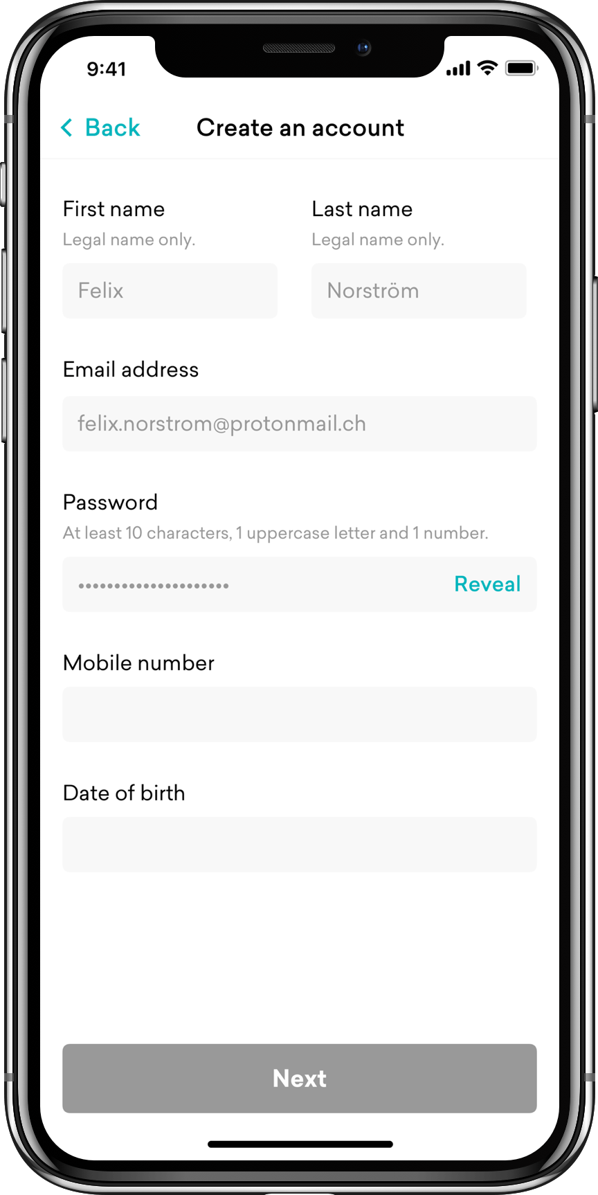
Create an account
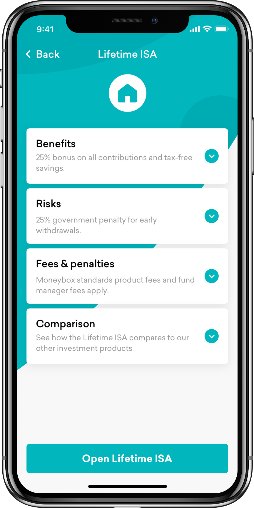
Select an investment product
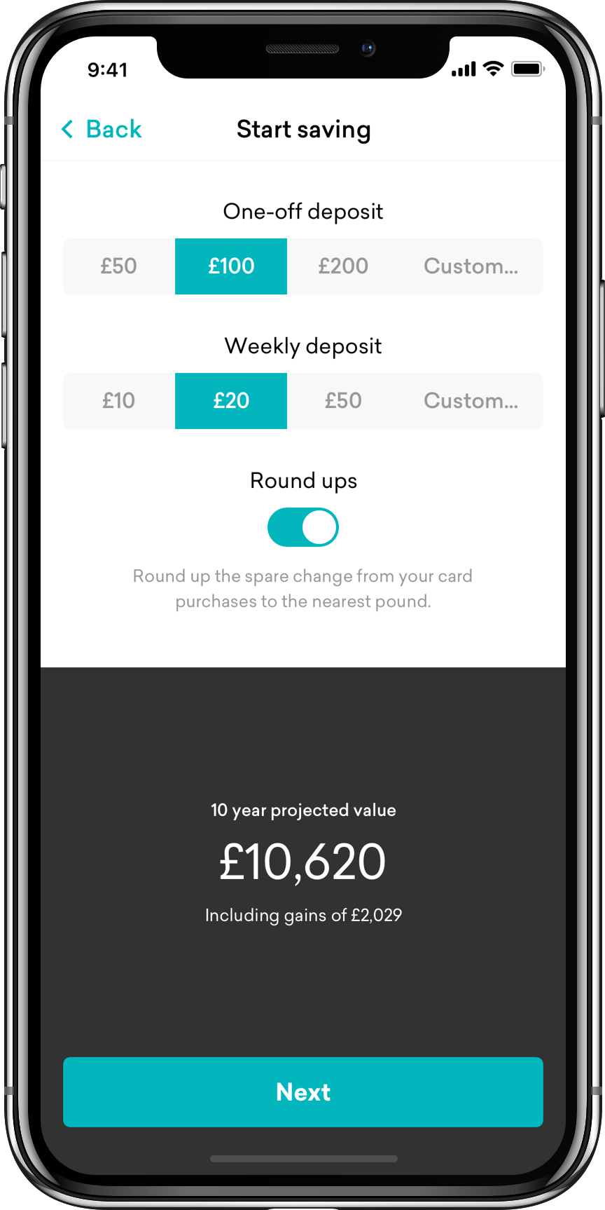
Kick-off your savings
We tested our initial prototype flow with over 20 people in our target audience to help find areas for improvement. We received great feedback about language being overly complex for the majority of users, so we redefined our terminology and documented it.
Launching gifted us with a wealth of positive results that we were extremely happy with.
Our screen-by-screen registration was also designed to enable a high degree of customisation. Collecting information up-front can typically fatigue users, but by collecting data points such as where users live we could approximate income, and therefore surface default investment amounts tailored to their financial situation. A series of experiments resulted in an additional £52M in assets per year.
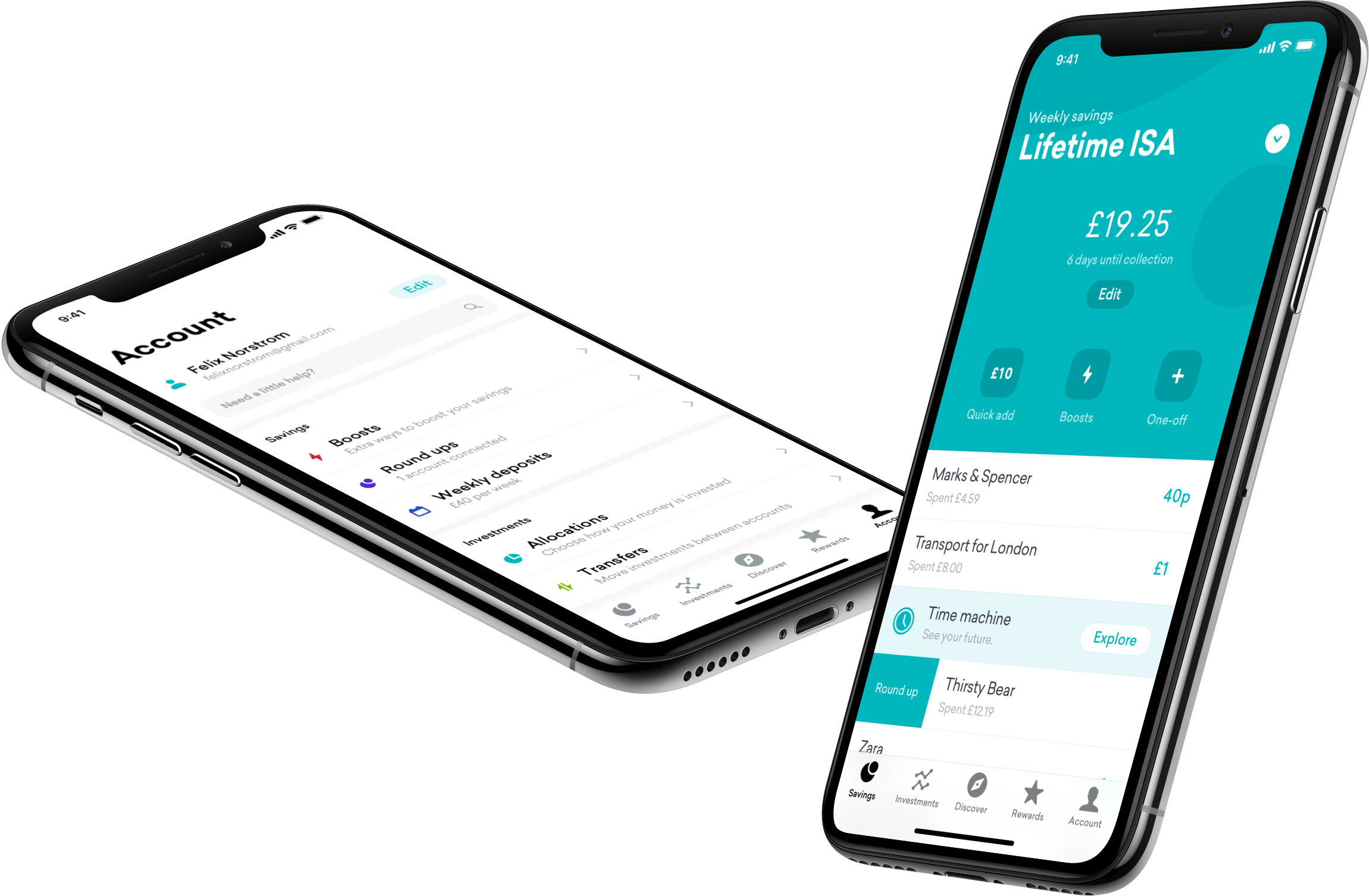
Unified design language
We built a unified design language that spanned Android, iOS and web to ensure customers would always have a consistent experience. It also allowed our developers to work extremely efficiently when developing new features.
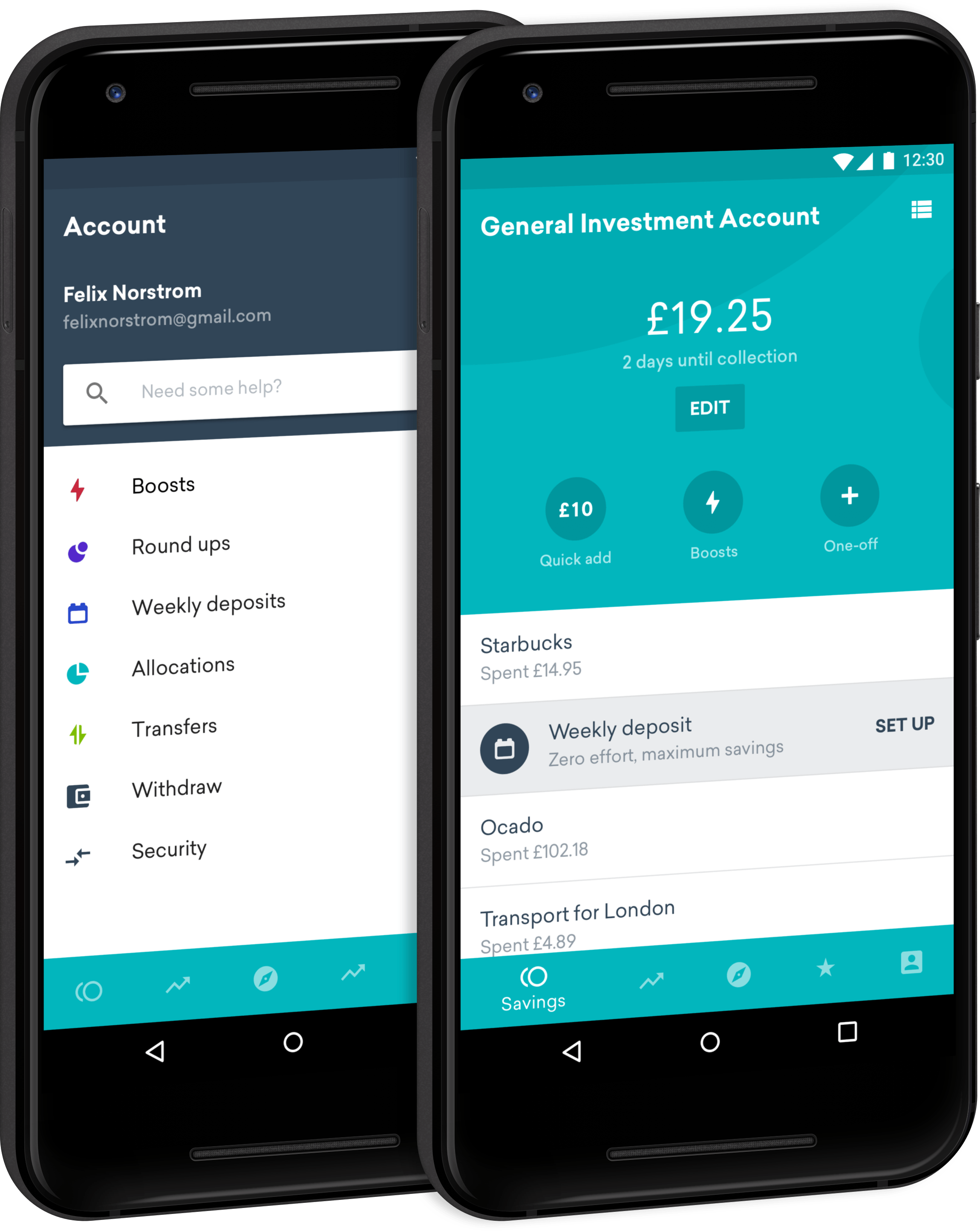
Although we wished both applications to feel native to their respective platforms we wanted to create consistency in branding between the platforms and inject more personality with custom iconography so utilised a simple and colourful set of icons to guide users through their journey.
It was rewarding for everyone to see such positive reviews from our users on the app stores. It also really helped bolster user trust with the company.
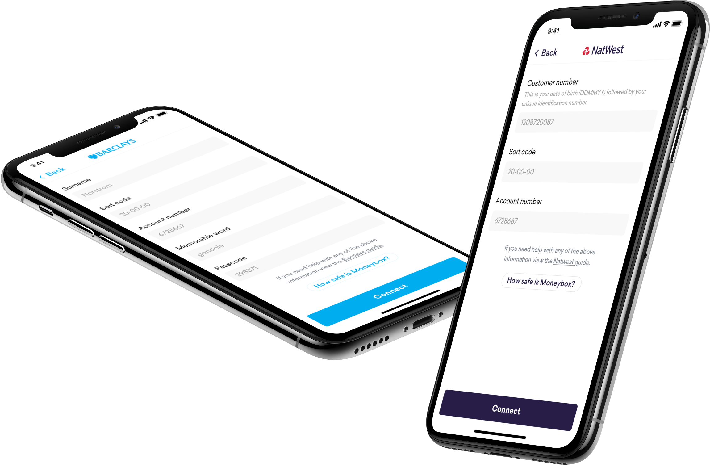
Gaining trust
Before the existence of Open Banking, Moneybox relied on screen scraping services to aggregate transaction data from user bank accounts. This required a user to hand over all details used to sign in to their bank’s online services, something they are continually told, never to do.
To help alleviate concerns that users may have had we incorporated each bank’s individual branding into a standalone connection screen and provided information about how Moneybox’s business is overseen by the FCA.
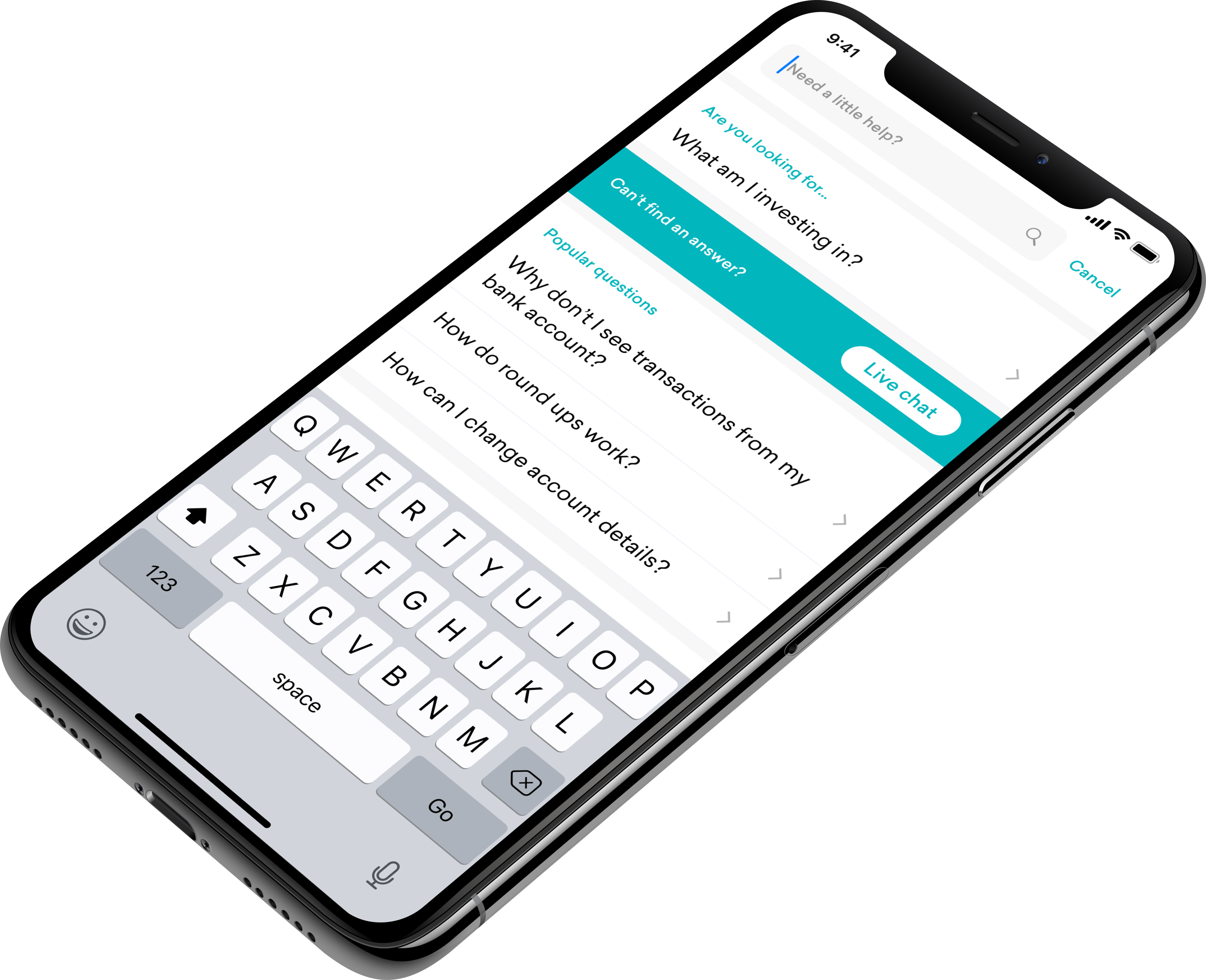
Supporting users
An open-office with a relatively small team proved to have a number of advantages for a designer. One such advantage was that the customer service team was within eavesdropping distance, so I would always hear user queries and frustrations.
Frequent queries would be collated and backlogged as addressable issues for the future.
One project I initiated was a revamped support center in an attempt to reduce the burden on the customer service team. It featured a de-prioritisation of live chat, instead encouraging people to solve their own queries. This resulted in a reduction of support queries by 48%.
Additionally, we surfaced answers, contextual to a user’s past actions. For example: if a user was previously attempting to connect a bank account before visiting the help screen, we would highlight articles regarding connecting a bank account.
Enabling discovery
Post-launch, the founders requested a way to notify customers of new products, or promote existing features.
I proposed a new tab in the application titled ‘Discover’. It consisted of a masonry layout composed of dynamic tiles that could surface the information and features we wanted to promote. Here, users would be able to look at their past saving history and discover new and existing features.
Each tile, once tapped, opened a modal screen to further explore the data. I wireframed a wide variety of these modal screens and collected feedback from our users.
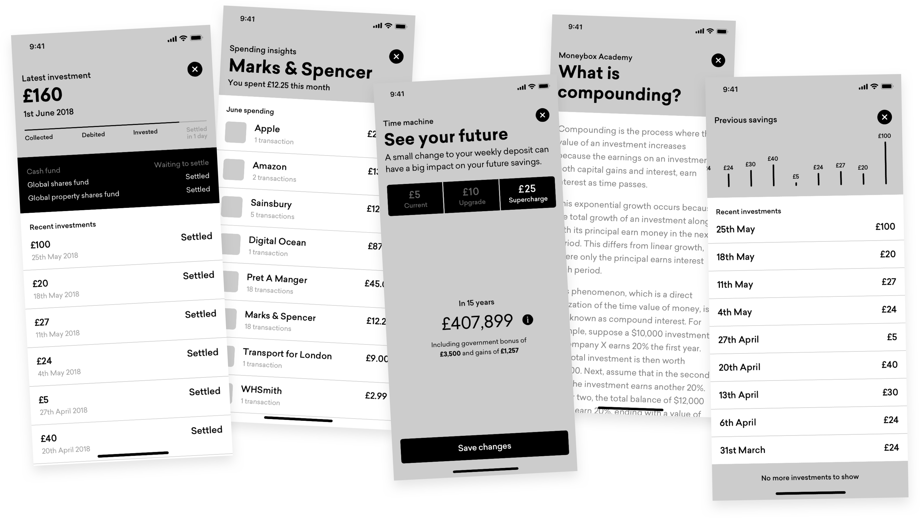
We held user testing sessions where we would unearth user’s pain points and gauge reactions to new features we wanted to implement. We received some extremely positive feedback around the Discover and subsequently developed and launched it in the proceeding month.
Many users remarked on our lack of projections within the app. We had designed Moneybox intentionally to not be focused on projections due to the unpredictability of the markets. Typical investment companies would show line graphs depicting user investments over time. We felt graphs were lazy, unoriginal, and particularly ill-suited to mobile devices. We also wanted to further reiterate that investing should be for the long term.
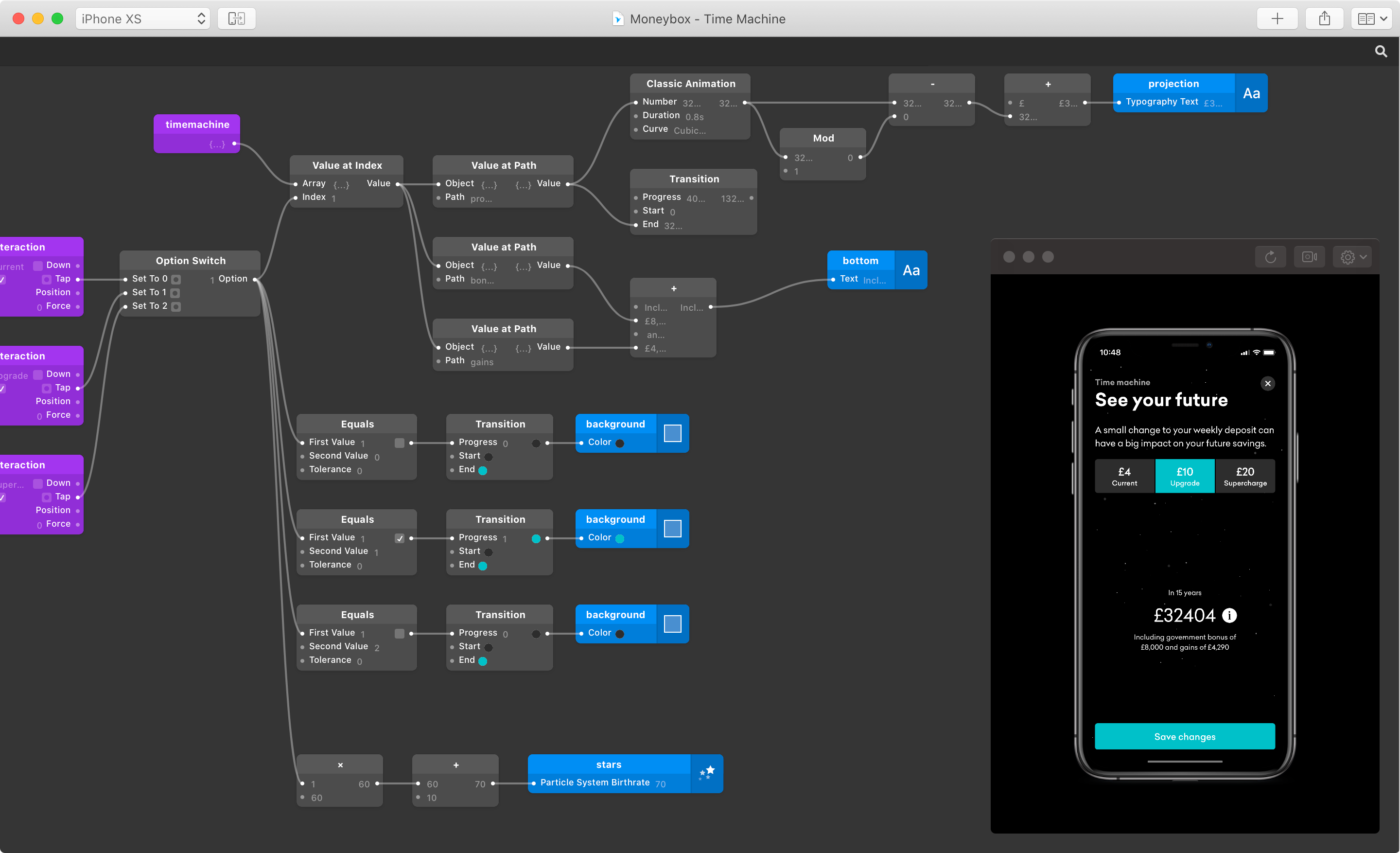
Our solution was to develop a module within the Discover tab called Time Machine. The phrasing is less dry than the typical “investment projections” and a lot more intriguing for our customers. Users can simply view their total investment value after 15 years if they increased their weekly deposits by a little or a lot more.
I wanted to add a little more fun and interactivity to incentivise users and distinguish our brand from competitors. I created a star-field particle system that would increase the velocity of the stars in a full-screen space scene each time a user increased the value of their weekly deposits.
This feature worked so well that we retroactively implemented it within the registration flow to great success.
By promoting existing features we were able to help our users save an additional £10M per year.
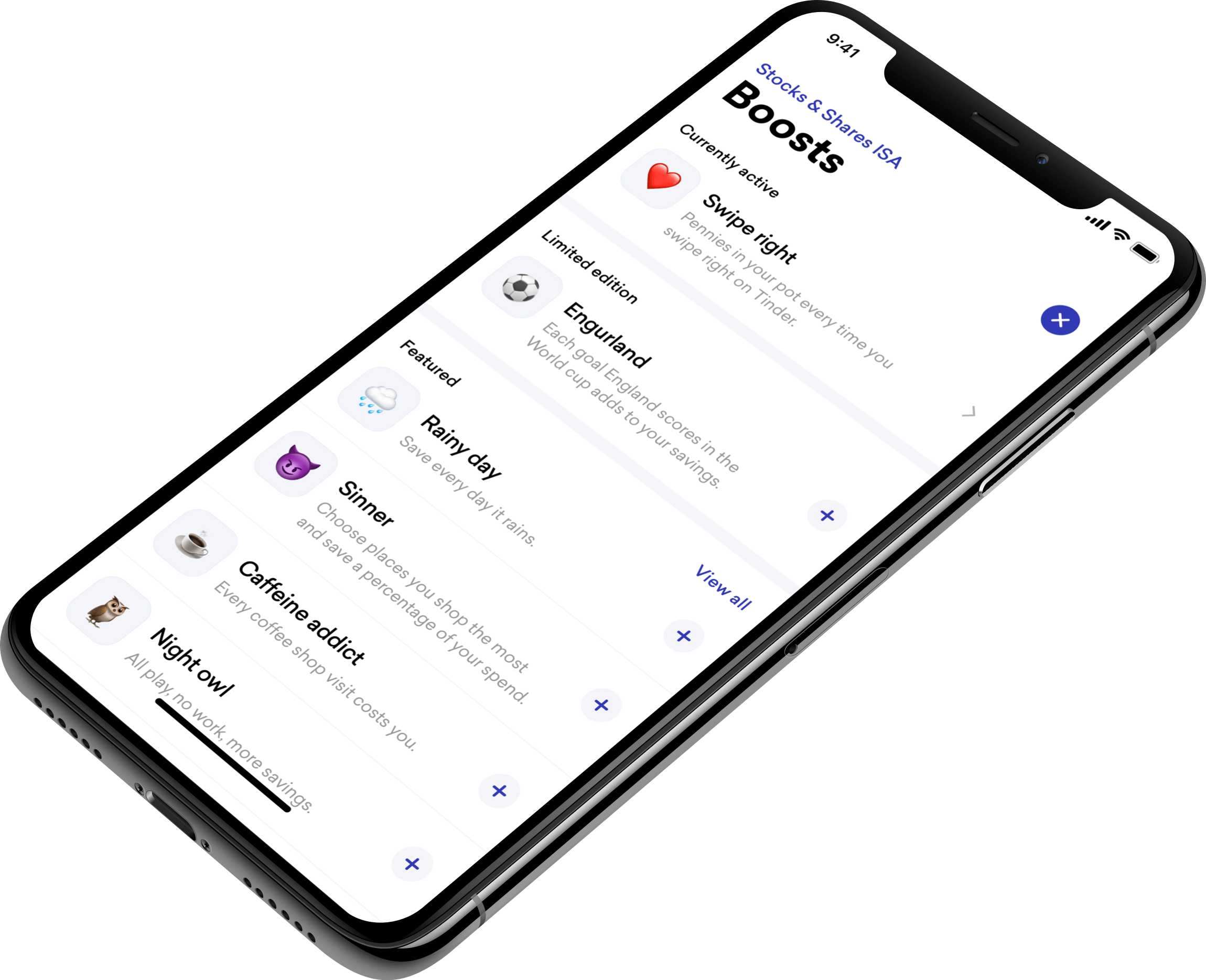
Boosting user savings
To futher encourage greater savings, I developed a series of fun ‘add-ons’ that allowed users to tax themselves when specific events occured. For example, depositing an amount each time England scored in the World Cup, or when you use your phone past midnight.
Ongoing
Moneybox have raised a number of rounds in recent years, most recently a £35M Series D round followed by a Crowdcube crowd fund of £7M.